

A great volleyball yearbook page does more than fill space between the football spread and the homecoming court—it becomes the definitive record of an entire season: the late-set kills in tight fifth sets, the libero diving across hardwood floors, the moments in the hallway when a team that started as strangers became something closer to family. Done well, a volleyball spread gives players a document they return to for decades, parents a keepsake that captures what they watched from the bleachers, and future athletes a standard to aspire to. Done poorly, it disappears into the back of the book and is forgotten by spring.
This guide covers everything yearbook staffers, coaches, and athletic directors need to create volleyball spreads that genuinely stand out—from photo strategy and layout design to caption writing, senior recognition, and the statistics that tell the season’s story in numbers.
Volleyball’s visual language is uniquely photogenic. The geometry of a serve receive, the elevation of a back-row attack, the synchronized footwork of a defensive rotation—these are images that reward photographers who know where to stand and editors who know how to frame them. Before touching design software, the most important thing a yearbook staff can do is treat the volleyball program with the same editorial ambition they bring to the most prominent spreads in the book.

The most memorable volleyball spreads and the most lasting recognition displays share the same quality: they treat team achievement as something worth preserving with care
What Makes a Volleyball Yearbook Page Work
The fundamental challenge of any sports spread is compression—taking four months of a season and finding the images, words, and design choices that communicate what it actually felt like. For volleyball specifically, this means resisting the temptation to lead with the generic team photo and fill the rest with game photos no one can identify.
The best volleyball yearbook pages have a point of view. They answer questions: What defined this team? What was the moment the season turned? Who grew the most? What will the seniors remember in twenty years? When editors can answer those questions before they touch a layout, the rest of the design decisions become clearer.
According to the National Federation of State High School Associations, volleyball is consistently one of the top three girls’ sports in U.S. high school athletics by participation, with over 450,000 participants across the country in recent survey years. That popularity means many yearbook readers have direct personal experience with the sport—either as players, family members, or classmates who followed the team through the season. The spread can assume a more knowledgeable audience than, say, a less-common activity page.
Planning the Volleyball Yearbook Spread Before the Season Ends
The most common mistake in sports yearbook coverage is treating it as a post-season task. The best volleyball spreads are built from content gathered throughout the year.
Assign Dedicated Coverage Early
Yearbook advisors who assign a photographer specifically to volleyball at the start of the fall season consistently get better spreads than those who scramble to collect photos in November. The photographer should attend:
- At least two away matches (different environments produce richer visual variety)
- A practice session (candid practice shots are often more compelling than game-day posed content)
- One team warmup and pregame routine
- Any senior recognition night or senior night ceremony
Volleyball senior night is particularly important to capture for the yearbook—the ceremonies, the flower presentations, the parent walks—because these are moments players remember most vividly and parents most want preserved.
Build a Shot List
Generic game coverage produces generic spreads. Give your volleyball photographer a specific shot list designed to capture variety:
Action shots to prioritize:
- Back-set or quick set at the peak of elevation
- Libero pass with full defensive crouch
- Block attempt with both outside hitters
- Ace serve captured from behind the service line
- Celebration after a point—the spontaneous kind, not a posed fist pump
Non-action shots that elevate a spread:
- Pregame huddle from above or a wide angle
- Coach and player during a timeout
- Players on the bench tracking the game
- The scoreboard at a decisive moment
- Shoes lined up in the locker room before a match
People-focused shots:
- Individual player portraits (informal, on the court, not the standard ID-photo pose)
- Senior players in their final home match
- The manager or statistician behind the table
- Parent section in the stands
Gather Content from Multiple Sources
Ask the team’s official photographer, parents who attended matches, and the athletic department for any photos taken through the season. A shared folder where the coach can drop candid photos creates a wider content pool than relying on a single photographer.

Schools that invest in documenting their athletic programs—through yearbooks, murals, and digital displays—create records that resonate long after the season ends
Volleyball Yearbook Page Layout Ideas
With strong content in hand, layout choices can amplify the visual story or undermine it. These design approaches work consistently well for volleyball spreads.
The Defining Moment Lead
Choose one exceptional action photograph—full bleed across the top half or the entire spread—and build everything else around it. This approach works when you have a genuinely strong image: a kill shot with real elevation and sharp focus, a sprawling defensive dig that communicates athleticism, or a team celebration photo with authentic emotion.
The key to the defining moment lead is restraint everywhere else. If the lead photo is carrying the spread, supporting images should be smaller and more varied in content rather than competing with additional large action shots.
The Grid Layout
Eight to twelve photos arranged in a consistent grid communicates variety and completeness. Grid layouts work especially well for teams with strong photo libraries because they allow editors to represent every player, multiple match settings, and the range of emotions across a season.
For volleyball, grids benefit from intentional sequencing: alternate between action and candid, between individual and group, between intensity and celebration. Monotonous action-shot grids feel like game film rather than editorial photography.
The Player Profile Panel
Dedicate one column or vertical strip to individual headshots or informal portraits of each player, paired with a one-line caption including name, class year, and position or a brief stat. The rest of the spread carries season coverage. This ensures every player appears by name while freeing the primary space for the most compelling images.
Player profile panels are particularly valuable for programs with large rosters where comprehensive individual recognition matters to parents and players alike.
The Season Timeline
Organize the spread chronologically with images and brief captions marking the progression from preseason to tournament or end of season. Timeline spreads help readers who followed the team recognize specific matches and moments, and they communicate the arc of the season in a way that individual action photos alone cannot.
According to a survey by the Journalism Education Association, yearbook students who receive structured layout training report significantly higher confidence in sports page design—suggesting that even simple frameworks like the timeline approach can elevate the quality of spreads produced by student staff.
Writing Captions for Volleyball Yearbook Pages
Captions are where most sports yearbook pages lose their potential. Weak captions state the obvious: “Senior outside hitter Jane Smith spikes the ball during a home match.” Strong captions tell readers something they cannot see in the photograph.
What Strong Volleyball Captions Include
Game context: The score, the set, the significance. “With the score tied 12-12 in the fifth set, a back-row attack from the service line gave the team match point in the biggest win of the regular season” communicates stakes. “A player attacks during a home match” does not.
Player identification: Name, class year, position. This matters most for action photos where identification isn’t obvious from the image.
Something unexpected or specific: A detail that proves the caption writer was paying attention. The comeback from two sets down. The first win against a rival in five years. The freshman who came off the bench in a rotation change and stayed there all season.
Season statistics where relevant: If a photo shows a setter at work, a caption noting her assist total for the season adds real editorial value. If an image captures the libero, her dig percentage is worth including.
Yearbook photo copyright and consent considerations are worth reviewing before finalizing a spread, particularly when using photos gathered from multiple sources—parents, outside photographers, or broadcast screenshots.
Headline Approaches That Work for Volleyball
Headlines should do more than announce the obvious. Instead of “Volleyball Team Has Successful Season,” consider:
- A record or milestone: “Five Consecutive District Titles” or “Program’s First Undefeated Home Record”
- A season theme: “Built in the Back Row” (if the team’s identity was defensive) or “System Ball” (if the offensive approach was the story)
- A moment: “The Fifth Set” as the headline for a spread built around the team’s late-season comeback wins
- A number: “470” (total kills across the season, or total digs by the libero)
The headline should feel like something the players themselves would recognize as capturing their season.

Hallway murals and digital displays work as year-round extensions of the documentation work yearbooks begin each fall season
Honoring Seniors on the Volleyball Yearbook Page
Senior recognition within a volleyball spread deserves its own section or sidebar treatment. These are the players for whom the yearbook spread has the most personal meaning—it is their final record of their athletic careers in this program.
Dedicated Senior Sections
A sidebar or inset panel dedicated to seniors should include:
- A photo for each senior, ideally an individual action shot or informal portrait rather than the standard school ID photo
- Name, years on varsity, position
- A brief note about career contributions—varsity letters, leadership roles, major statistical achievements or records
- A personal quote from the player, gathered in the fall rather than rushed in production
Gathering senior quotes early is critical. The most authentic quotes about a season come from players while they are still in it, not after it ends.
Four-Year Career Recognition
For programs with strong record-keeping, noting career statistics for multi-year seniors adds real depth to the recognition. A player who dug over 800 balls across four seasons, or a setter who distributed assists for three varsity seasons, has a career worth noting beyond a single-year stat line.
High school fall sports championships coverage often intersects with senior class documentation—if a senior class’s four years coincide with a championship run, that narrative belongs in the yearbook spread as much as in any other section.
Making Space for the Managers and Support Staff
Too many volleyball spreads recognize only the players on the court. Including the team manager, the statistician, the trainer, and any student support staff communicates that the yearbook staff understands what a program actually takes to run. These individuals often have no other place in the book where their contribution to the athletic program appears by name.
Capturing the Season in Statistics
A volleyball yearbook page without statistics is a missed opportunity. Numbers situate the team’s story in concrete, verifiable terms—and they give future readers a point of reference for understanding what the season meant in context.
Statistics Worth Including on the Page
Team statistics:
- Season record (overall and conference separately if applicable)
- Sets won vs. sets lost
- Points differential in close matches
- Postseason result—district, regional, state placement
Individual statistics worth highlighting:
- Kills leader with total
- Dig leader (especially valuable for showcasing the libero’s contribution)
- Service ace leader
- Setter’s total assists
- Blocking leader if relevant to team’s playing style
Program records or milestones:
- Any individual or team record set during the season
- Win milestones for the program or coaching staff
- First-time achievements (first conference title, first top-10 state ranking, first win over a specific opponent)
Design consistency across a sports spread matters particularly for statistics sections—using consistent typography, alignment, and visual treatment for numbers prevents the page from feeling cluttered when multiple stat categories appear together.
Presenting Statistics Visually
Raw stat tables are functional but rarely engaging design elements. Consider:
- Pull-quote style: Large-type treatment of a single standout number (e.g., a large “47” with smaller text reading “consecutive service points in the district final”)
- Infographic elements: A simple horizontal bar comparing this season’s win total to the previous three seasons
- Record callouts: A distinct visual element—box, color block, or icon—marking any new program record alongside the standard stat line
Color, Design, and Visual Identity for Volleyball Spreads
The most cohesive volleyball yearbook pages reflect the program’s visual identity—school colors, logo elements, the distinctive visual language of the team’s environment.
School Colors as Design Anchors
Using school colors in design elements (section headers, stat callouts, border treatments) creates visual unity between the volleyball spread and the rest of the athletic section. This sounds obvious but is frequently ignored in favor of generic blue-and-white or neutral design choices that could belong to any school.
If the volleyball team competes in a gym with distinctive wall colors, floor graphics, or scorer’s table branding, incorporating those design elements into the spread creates visual continuity between the photographs and the surrounding page treatment.
Typography for Sports Spreads
Headlines on volleyball pages should read with energy—condensed serif or bold sans-serif type that communicates athletic purpose. Body text and captions should be highly legible at small sizes because they will often be set in tight columns alongside large photographs.
Avoid the temptation to use too many typefaces. Two—one for display headlines and one for captions and body text—are sufficient. Consistency in typography is one of the lowest-effort, highest-impact design decisions a yearbook staff can make.
School display cases and traditional recognition formats share design principles with yearbook sports spreads: the goal in both cases is to present athletic achievement in a format that communicates both pride and permanence.

Consistent visual identity—school colors, mascots, and design language—creates recognition that extends from the yearbook spread to the athletic facility's permanent displays
Interviewing Coaches and Players for the Volleyball Spread
Yearbook coverage that includes direct quotes from coaches and players reads as editorial journalism rather than pure photo documentation—and it gives readers something a photograph cannot provide: the human perspective on what the season meant.
Questions That Generate Useful Quotes
Ask coaches:
- What was this team’s defining characteristic—the thing that made them different from previous groups?
- What match from this season would you show someone who had never seen this team play?
- What will you remember about this senior class specifically?
Ask players:
- What is the one moment from this season you will still remember in ten years?
- What did this team figure out together that you could not have predicted at the start of the fall?
- What would you tell next year’s team about what it takes to compete in this program?
These questions invite reflection rather than recitation of facts. They produce quotes that do editorial work in a spread—quotes that communicate what the season felt like from the inside.
Short-Form Sidebars
A “Voices from the Season” sidebar—four or five brief quotes from different players and coaches, each one to three sentences—occupies a modest amount of layout real estate and adds enormous editorial depth. It also ensures representation across the roster rather than featuring only the seniors or highest-profile players.
Extending Volleyball Recognition Beyond the Yearbook
The yearbook page captures a single season. For programs building multi-year traditions, the question of how athletic achievement persists beyond the annual book matters more than most yearbook staffs have reason to consider—but it is worth addressing in the spread itself.
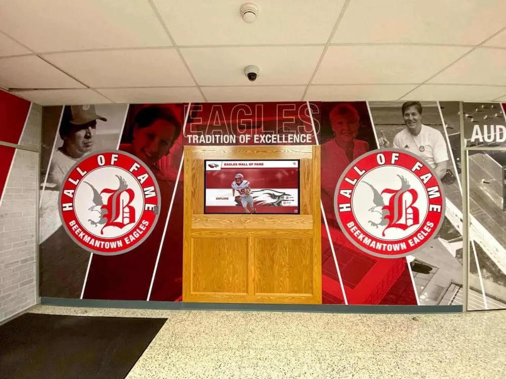
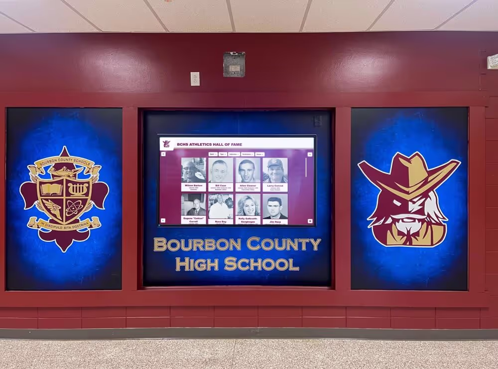
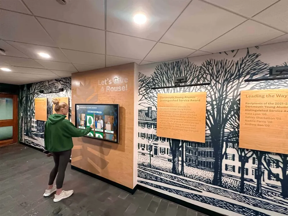
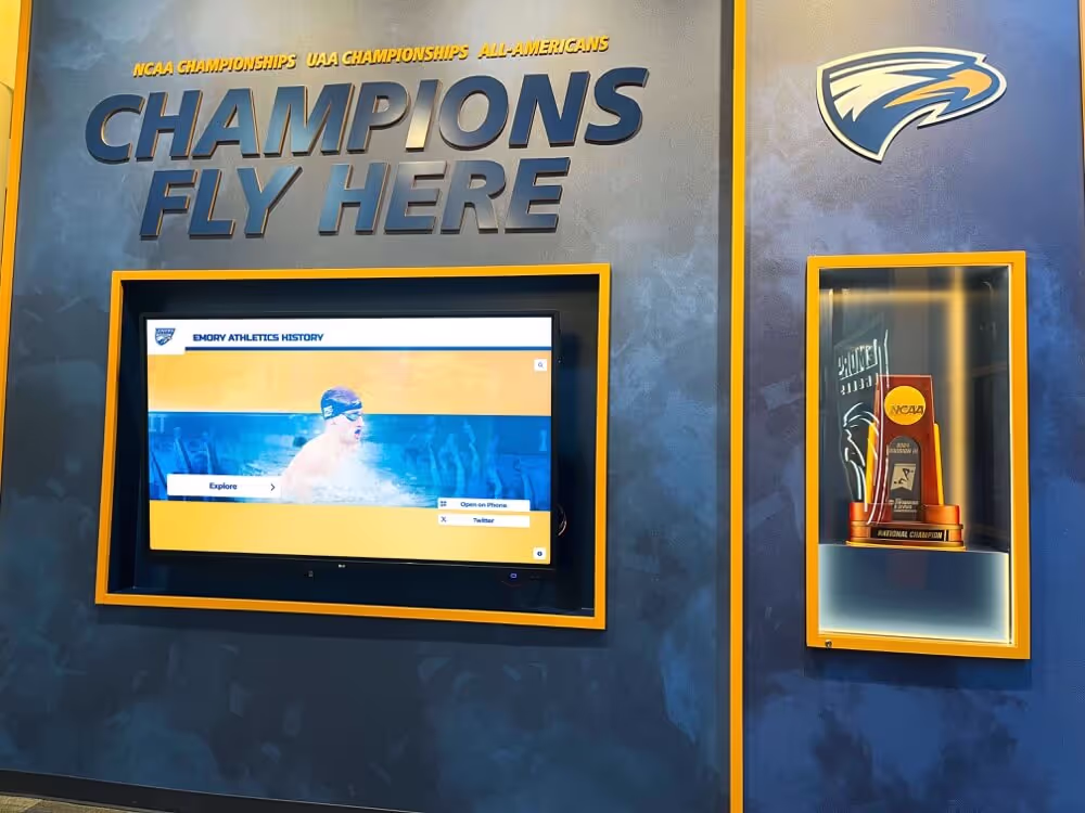
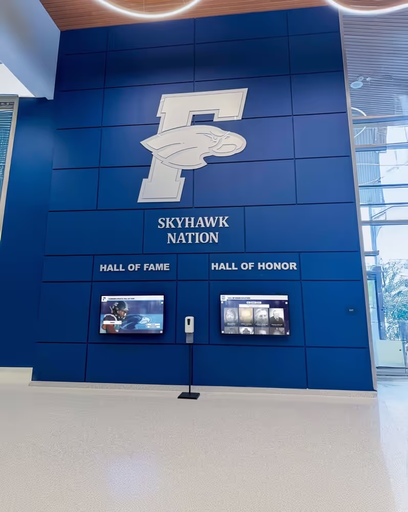
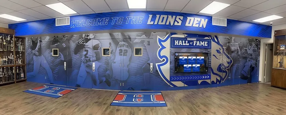
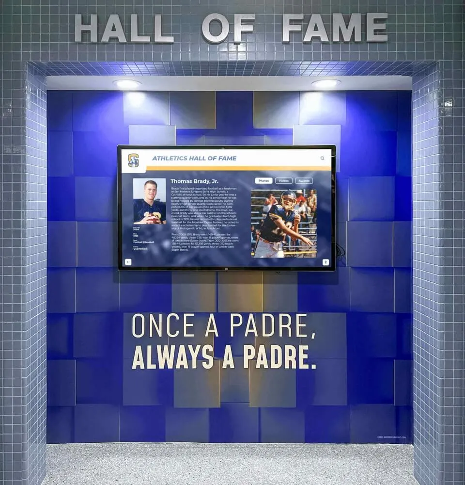
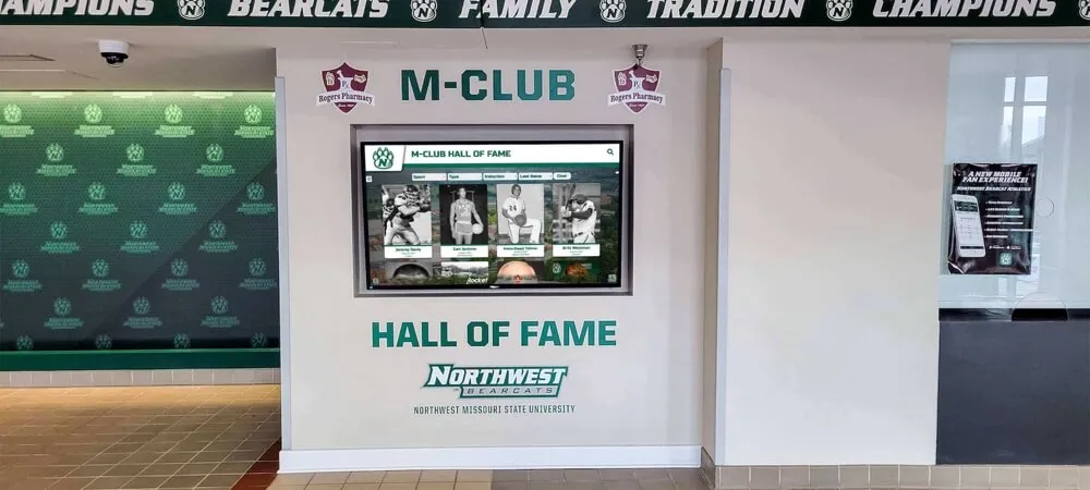
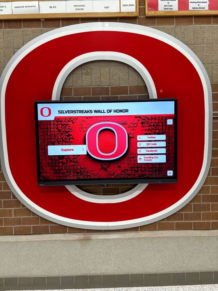
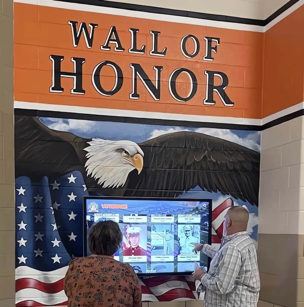
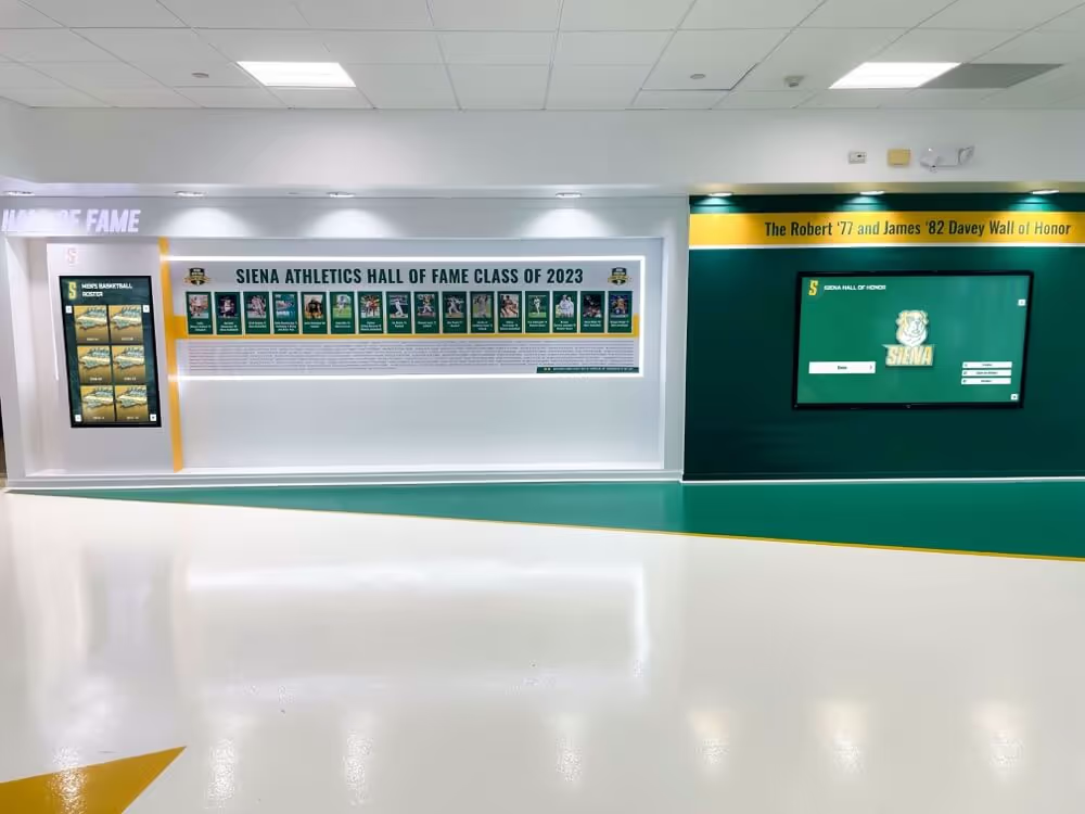
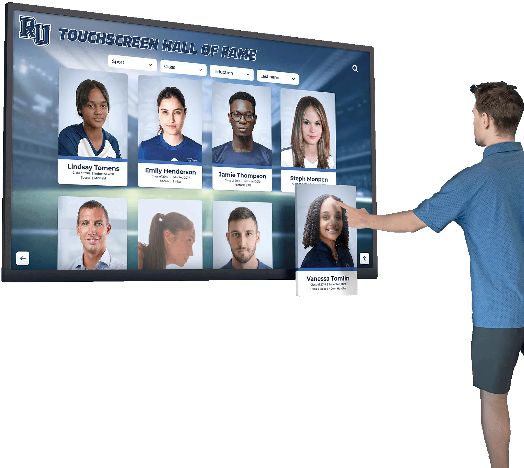
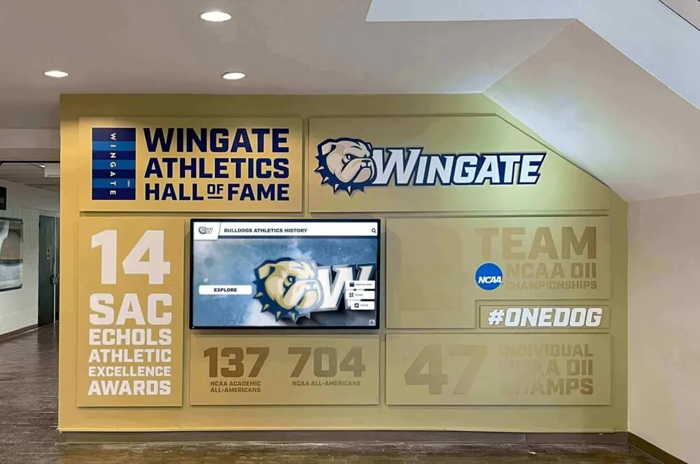
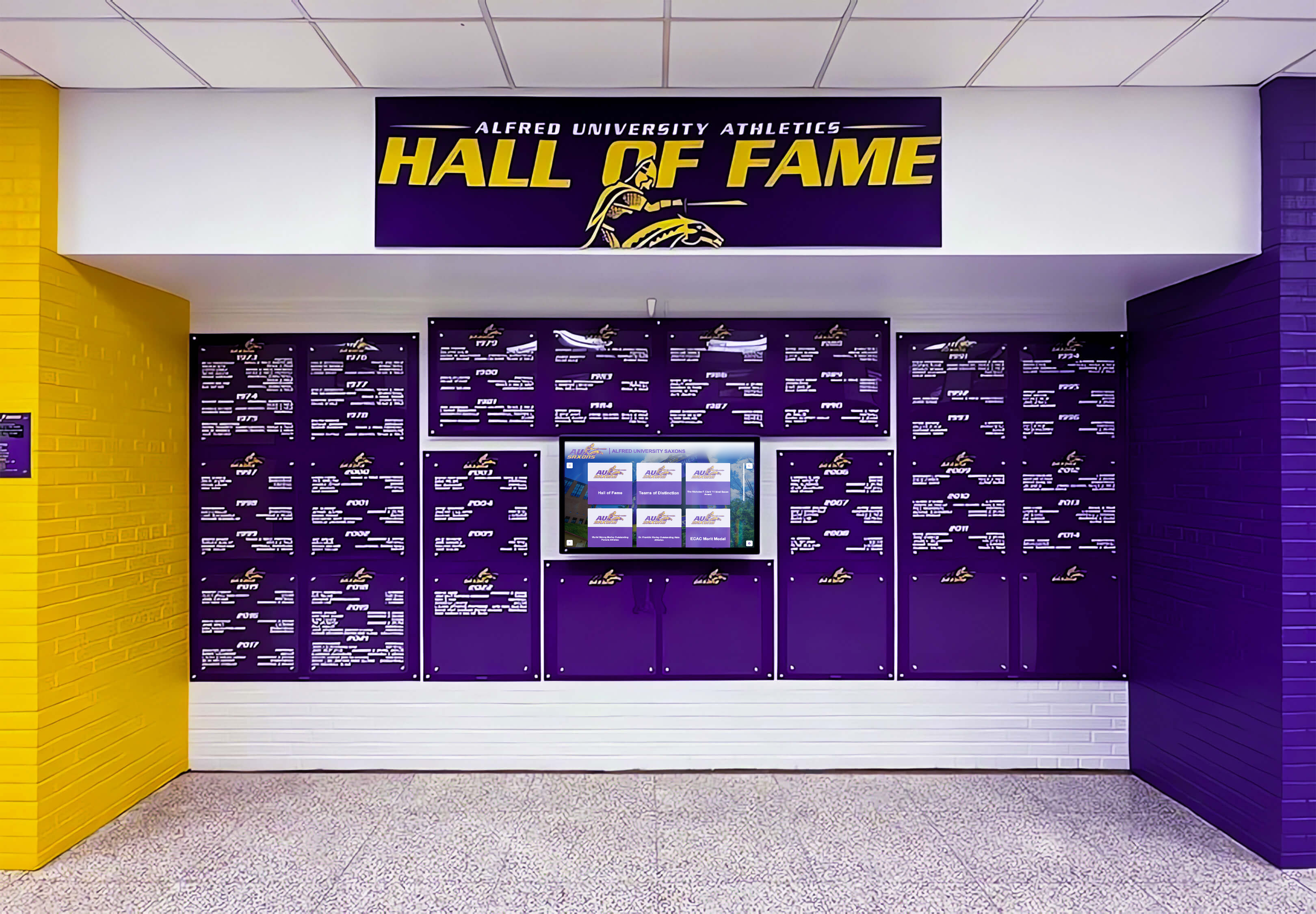
Digitizing old yearbooks into hall of fame displays is an increasingly common way schools preserve historical athletic achievement that lives in yearbooks but has never been accessible in the gym or hallway where the team practices and competes. A volleyball program with decades of history in yearbook archives has a record of achievement that, made digitally accessible, can inspire current players in ways a physical book sitting in the library cannot.
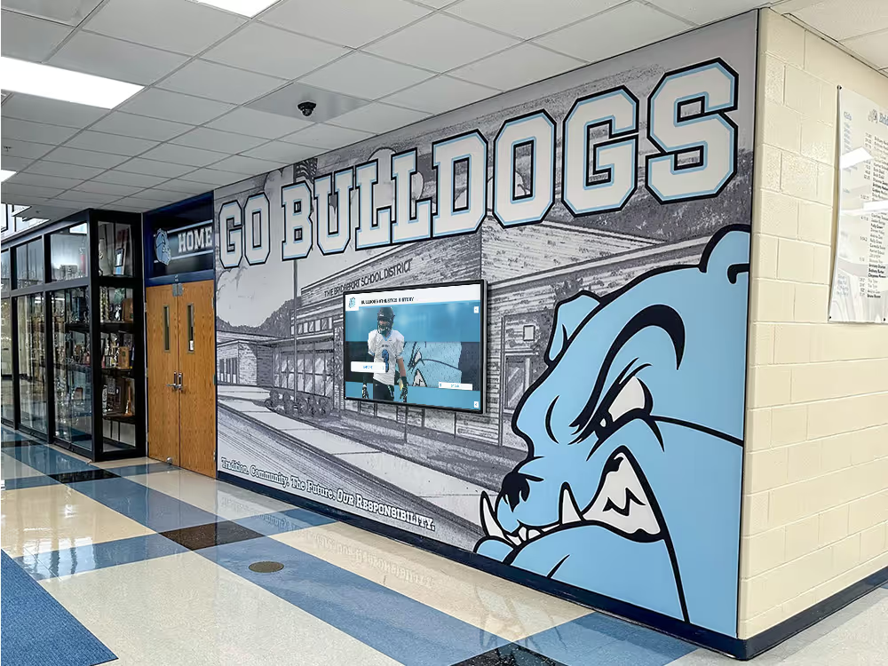
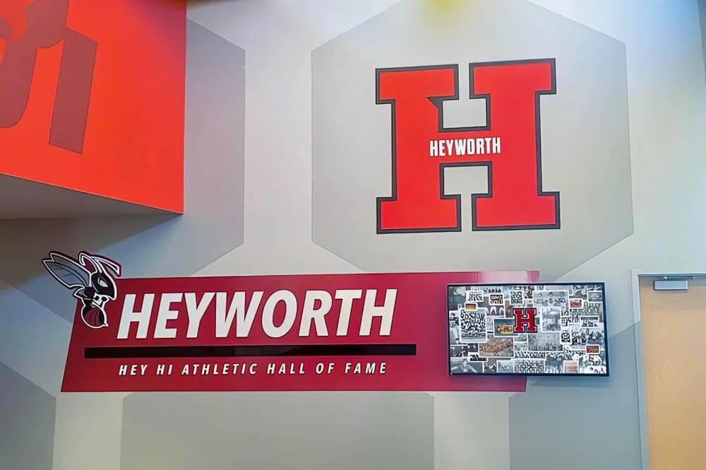
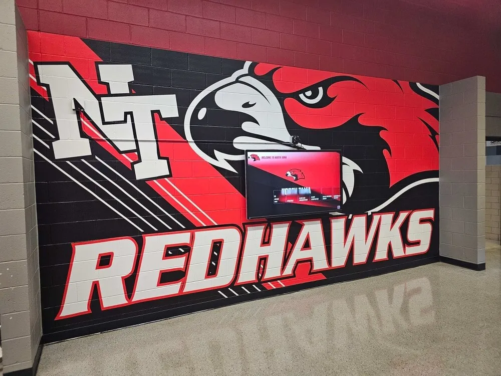
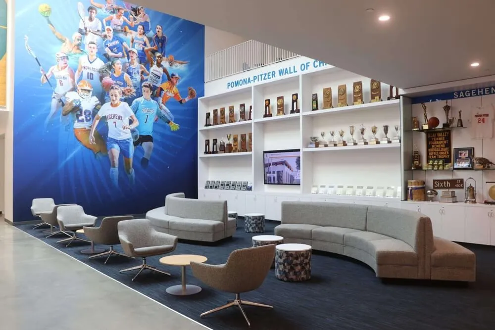
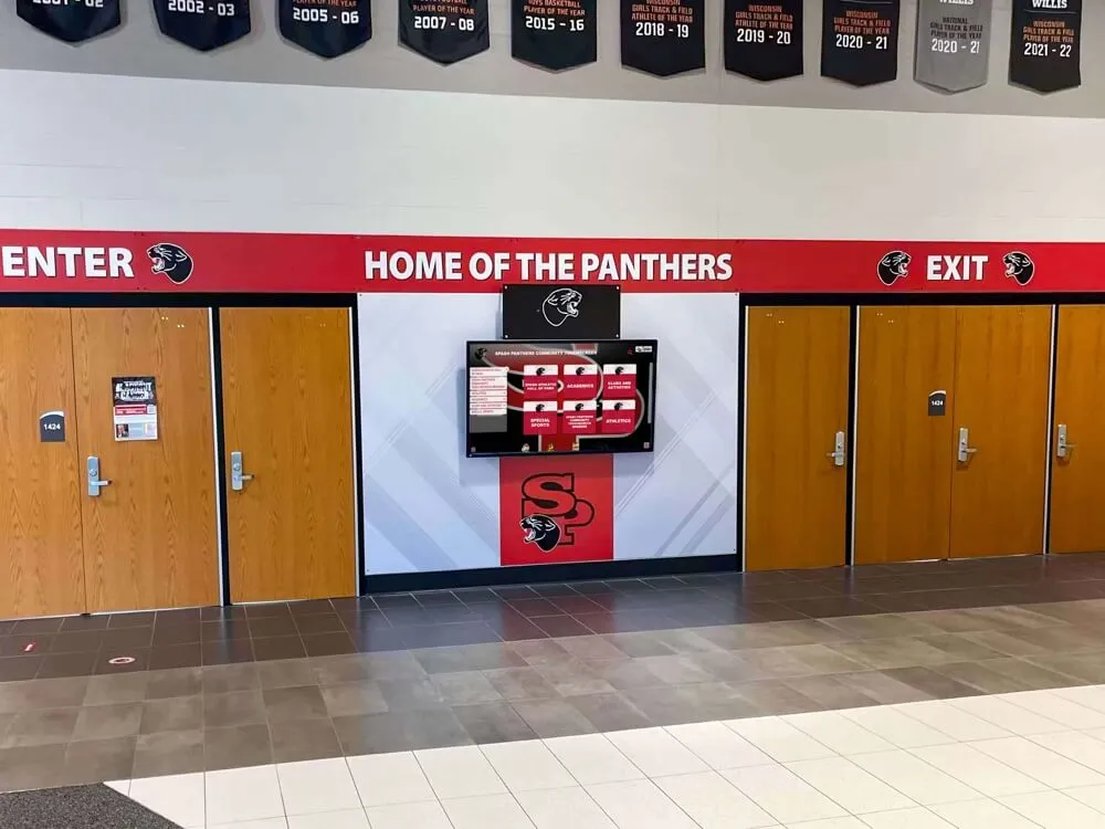
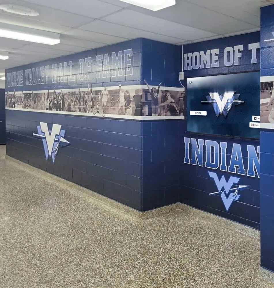
School banners in halls and gyms are the most common physical extension of yearbook-era documentation—championship years, notable seasons, and individual records that migrate from the book into the athletic environment itself. These permanent markers connect current athletes to the history the yearbook helped preserve.
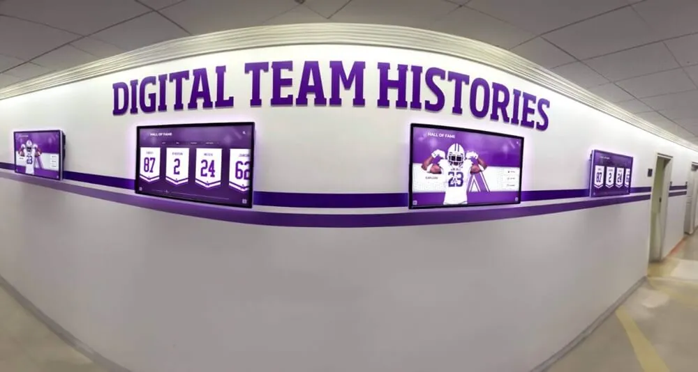
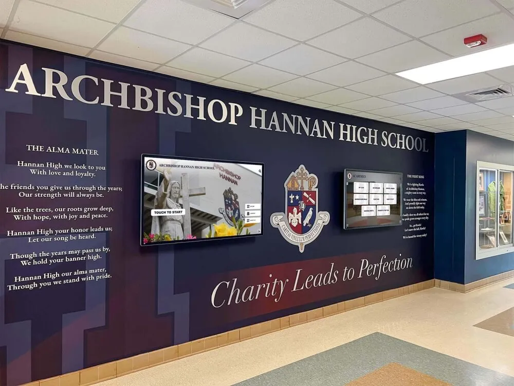
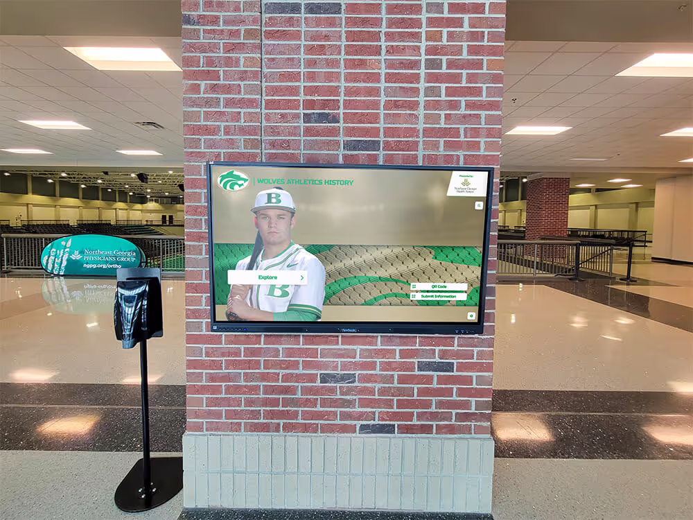
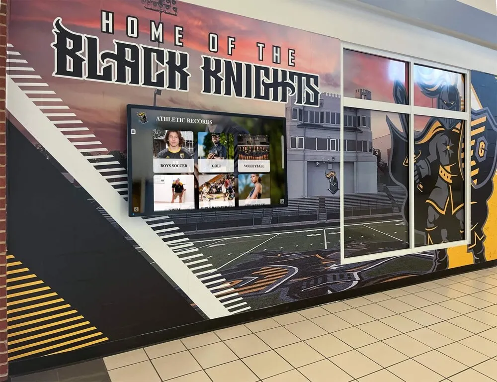
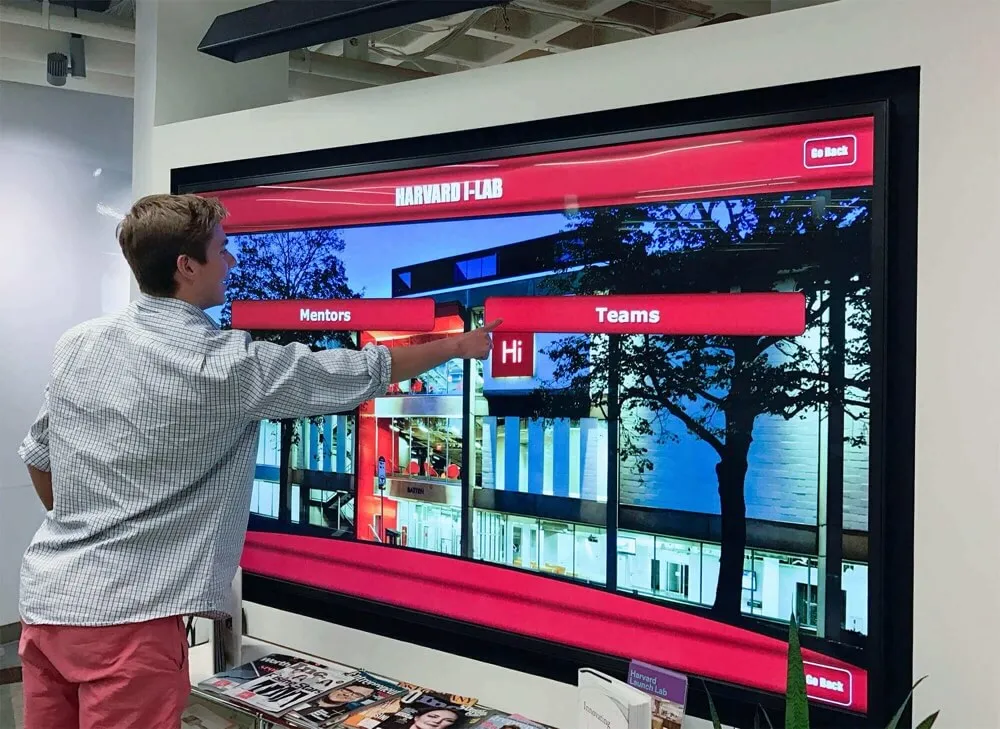
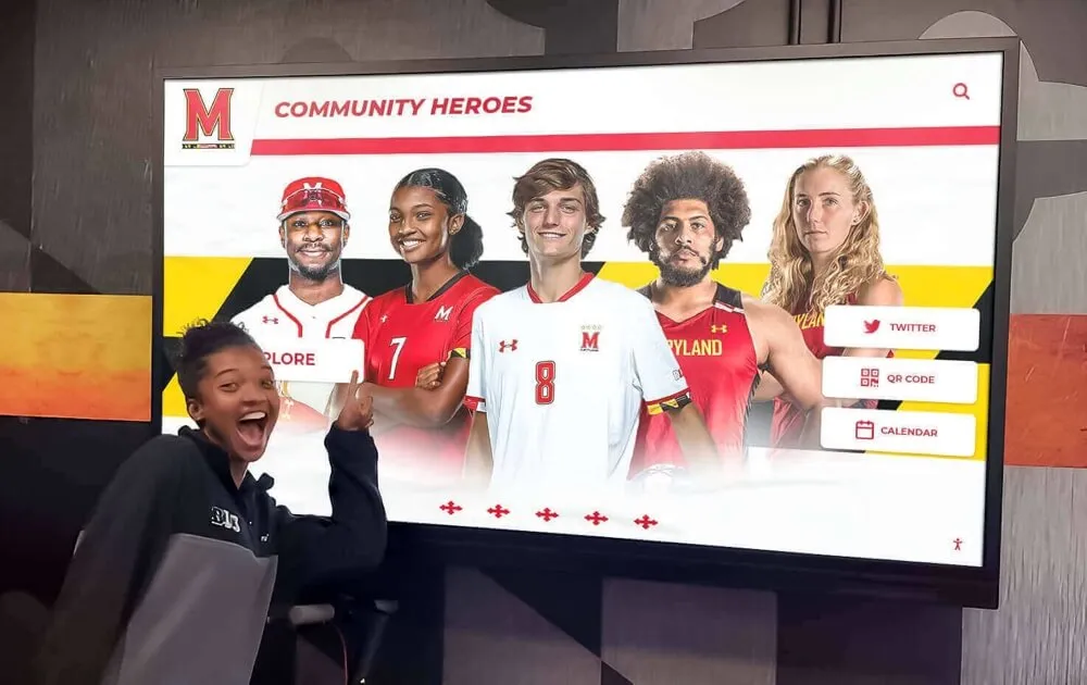
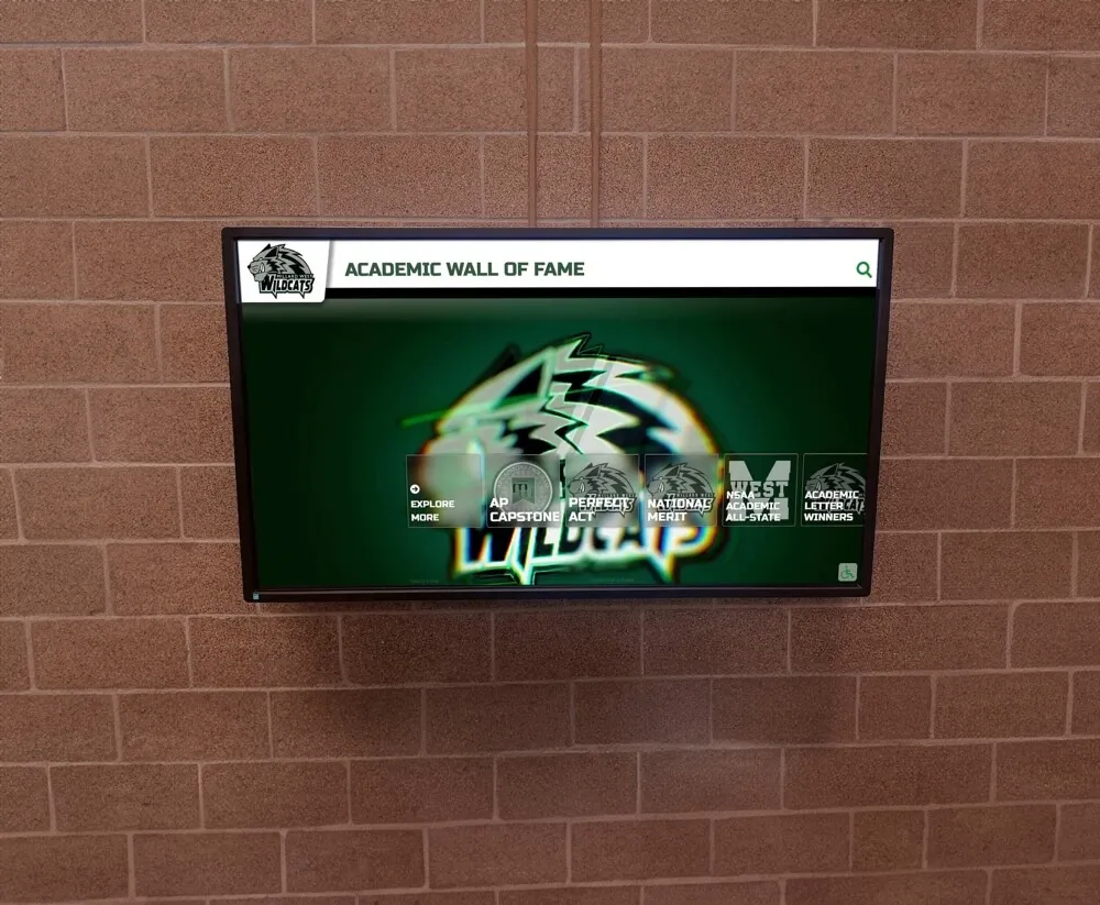
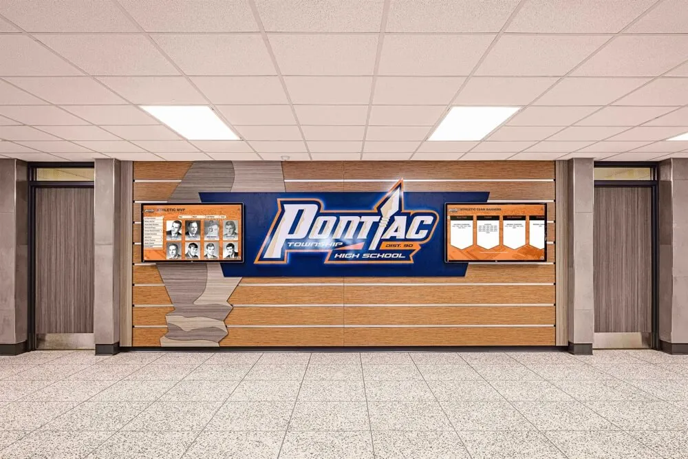
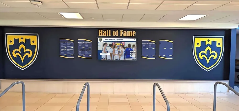
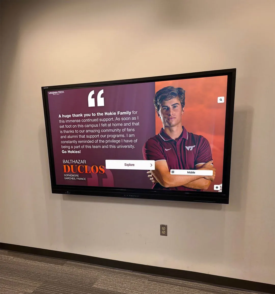
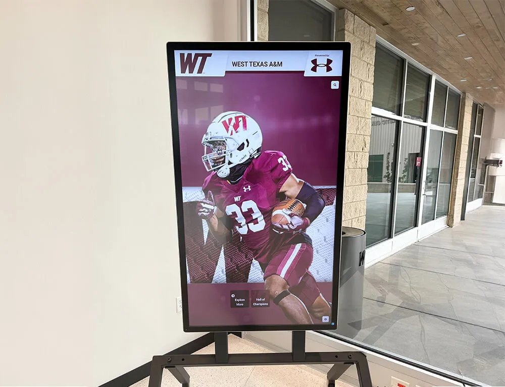
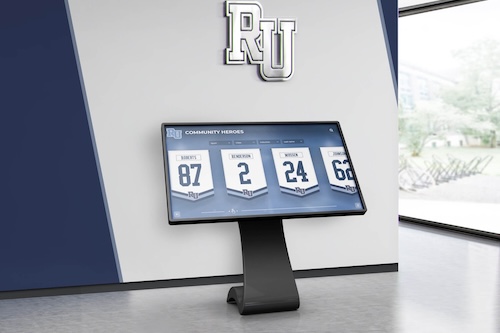
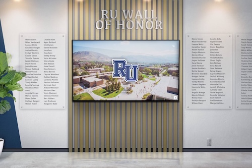
Interactive touchscreen recognition storytelling represents a more recent development: digital systems that surface the same historical records, player profiles, and season documentation that yearbooks have always provided—but in the gym, lobby, or hallway, where athletes and visitors encounter them daily rather than once at the end of the school year.

Athletic hallway recognition systems—shields, banners, and digital displays—carry forward the seasonal documentation that begins with the yearbook spread
Common Mistakes to Avoid on Volleyball Yearbook Pages
Understanding what not to do is as valuable as design inspiration:
Relying on the team photo as the lead image: The team photo belongs on the spread, but as one element among several rather than the visual anchor. A team photo is static and predictable—lead with action or genuine emotion.
Representing only the starting rotation: Spreads that feature the same five or six players in every photo communicate to reserves, parents, and coaches that the yearbook staff did not actually watch the team. Make representation across the roster a deliberate design goal.
Generic headlines: “Lady Rockets Have Strong Season” tells readers nothing. Write a headline that is true only for this team in this year.
Overcrowded layouts: More photos do not produce better spreads. Choosing eight strong images and giving each enough space to breathe produces a more compelling result than cramming fifteen mediocre photos into the same space.
Missing the off-court moments: The moments between matches—the locker room before a tough road match, the bus ride home after a loss, the team pasta dinner—are often more emotionally resonant than any game photograph. Make sure at least one or two off-court images appear on the spread.
Late content gathering: Starting content collection in October for a November season means missing preseason camps, early matches, and the moments before the team knew what it was going to become.
Digital signage resources for schools that have explored how to present athletic content in public-facing displays have worked through similar editorial questions—which moments deserve visibility, how to represent a team across individuals, and how to balance action documentation with the quieter content that conveys team culture.
Volleyball Yearbook Pages as Part of a Broader Recognition Culture
Schools that produce strong volleyball yearbook spreads year after year tend to share a broader commitment to athletic recognition—one that extends from the yearbook into the gym, the trophy case, the hallway, and the community. The yearbook spread is not a standalone project; it is one piece of documentation within a culture that treats athletic achievement as worth preserving carefully.
That recognition culture benefits from consistency across formats. Lacrosse senior night traditions and volleyball senior night documentation share the same logic: moments that matter to athletes and families deserve to be captured with intention and preserved in multiple formats, not just acknowledged in the moment and forgotten.
For schools building or refreshing their athletic recognition infrastructure—whether through yearbook improvements, hall of fame displays, or permanent program documentation—the volleyball spread is a useful starting point precisely because it forces editors to answer the question of what, exactly, makes this program worth remembering.
Frequently Asked Questions About Volleyball Yearbook Pages
What should be on a volleyball yearbook page?
A volleyball yearbook page should include a lead action photo, supporting images capturing variety across roster members and match settings, senior recognition, team and individual statistics, a headline specific to this season, and captions that provide game context beyond what the images show. Candid and off-court moments add depth that action-only spreads lack.
How many photos should a volleyball yearbook spread have?
Six to twelve photos across a two-page spread is the standard range. Prioritize quality and variety over volume—six exceptional images with room to breathe outperform twelve average photos competing for attention. Ensure the selection represents multiple players, multiple match settings, and a mix of action and candid content.
What makes a good volleyball yearbook caption?
A strong caption includes player identification (name, class year, position), specific game context (score, match significance, what happened in the moments surrounding the image), and at least one detail readers cannot derive from the photo itself. Season statistics, record context, and personal notes from coaches or players elevate captions from descriptive to editorial.
When should yearbook staff start gathering volleyball content?
At the start of the fall season—August or early September in most U.S. school calendars. Assigning a dedicated photographer before the first match ensures coverage of preseason practice, early matches, and the candid moments that define a team’s culture. Content gathered late in the season cannot replace what was not documented at the beginning.
How do you recognize seniors on a volleyball yearbook page?
Use a dedicated sidebar or panel with an individual image, years on the program, and a personal quote gathered during the season. Career statistics or notable achievements across multiple seasons add genuine depth. Including personal messages or memories from the coach about each senior communicates that the recognition is specific, not formulaic.
Ready to take your school’s athletic recognition beyond the yearbook?
Rocket Alumni Solutions designs and installs interactive digital recognition displays, hall of fame systems, and donor walls for high schools, universities, and organizations across the country. Whether you want to transform your volleyball program’s yearbook history into a permanent hallway display, build a touchscreen hall of fame that surfaces decades of athletic records, or create a recognition environment where current athletes see the tradition they are adding to every day they walk into the gym—we build the systems that make that recognition visible and lasting.